無障礙訪問
網路無障礙(也稱為 a11y)是指建立可供任何人使用的網站——無論是殘疾人、緩慢的網路連線、過時或損壞的硬體,還是處於不利環境中的使用者。例如,為影片新增字幕將幫助您的聾人和聽力受損使用者以及那些在嘈雜環境中且聽不到手機的使用者。同樣,確保您的文字對比度不要太低將幫助您的低視力使用者和那些在明亮的陽光下使用手機的使用者。
準備開始但不確定從哪裡入手?
檢視由 全球資訊網聯盟(W3C)提供的網路無障礙規劃和管理工作指南
跳轉連結
您應在每個頁面的頂部新增一個直接跳轉到主要內容區域的連結,以便使用者可以跳過在多個網頁上重複的內容。
通常這會在 App.vue 的頂部完成,因為它將是您所有頁面上的第一個可聚焦元素
模板
<ul class="skip-links">
  <li>
    <a href="#main" ref="skipLink" class="skip-link">Skip to main content</a>
  </li>
</ul>
要隱藏連結除非它被聚焦,您可以新增以下樣式
css
.skip-link {
  white-space: nowrap;
  margin: 1em auto;
  top: 0;
  position: fixed;
  left: 50%;
  margin-left: -72px;
  opacity: 0;
}
.skip-link:focus {
  opacity: 1;
  background-color: white;
  padding: 0.5em;
  border: 1px solid black;
}
一旦使用者更改路由,將焦點返回到跳轉連結。這可以透過對跳轉連結的模板 ref 呼叫 focus 來實現(假設使用 vue-router)
vue
<script setup>
import { ref, watch } from 'vue'
import { useRoute } from 'vue-router'

const route = useRoute()
const skipLink = ref()

watch(
  () => route.path,
  () => {
    skipLink.value.focus()
  }
)
</script>內容結構
無障礙性最重要的部分之一是確保設計可以支援可訪問的實現。設計不僅應考慮顏色對比度、字型選擇、文字大小和語言,還應考慮應用程式中內容的結構。
標題
使用者可以透過標題導航應用程式。為應用程式的每個部分新增描述性標題可以更輕鬆地預測每個部分的內容。在標題方面,有一些推薦的輔助功能實踐
- 巢狀標題在其排名順序中:
<h1>-<h6> - 不要在部分內跳過標題
- 請使用實際的標題標籤而不是透過樣式來設定文字的標題外觀
模板
<main role="main" aria-labelledby="main-title">
  <h1 id="main-title">Main title</h1>
  <section aria-labelledby="section-title-1">
    <h2 id="section-title-1"> Section Title </h2>
    <h3>Section Subtitle</h3>
    <!-- Content -->
  </section>
  <section aria-labelledby="section-title-2">
    <h2 id="section-title-2"> Section Title </h2>
    <h3>Section Subtitle</h3>
    <!-- Content -->
    <h3>Section Subtitle</h3>
    <!-- Content -->
  </section>
</main>
地標
地標 提供了對應用程式內部部分的程式性訪問。依賴輔助技術的使用者可以導航到應用程式的每個部分並跳過內容。您可以使用 ARIA 角色 來幫助實現這一點。
| HTML | ARIA 角色 | 地標用途 |
|---|---|---|
| header | role="banner" | 主要標題:頁面的標題 |
| nav | role="navigation" | 用於在文件或相關文件中導航的連結集合 |
| main | role="main" | 文件的主要或中心內容。 |
| footer | role="contentinfo" | 關於父文件的資訊:腳註/版權/隱私宣告的連結 |
| aside | role="complementary" | 支援主要內容,但本身也是獨立且有意義的。 |
| search | role="search" | 本節包含應用程式的搜尋功能。 |
| form | role="form" | 與表單相關的元素集合 |
| section | role="region" | 相關內容,使用者可能會想要導航到。必須為此元素提供標籤。 |
語義表單
在建立表單時,您可以使用以下元素: <form>、<label>、<input>、<textarea> 和 <button>
標籤通常放置在表單欄位上方或左側
模板
<form action="/dataCollectionLocation" method="post" autocomplete="on">
  <div v-for="item in formItems" :key="item.id" class="form-item">
    <label :for="item.id">{{ item.label }}: </label>
    <input
      :type="item.type"
      :id="item.id"
      :name="item.id"
      v-model="item.value"
    />
  </div>
  <button type="submit">Submit</button>
</form>
注意您可以在表單元素上包含 autocomplete='on',它將應用到您表單中的所有輸入。您也可以為每個輸入設定不同的 自動完成屬性值。
標籤
為所有表單控制元件提供標籤以描述其目的;連結 for 和 id
模板
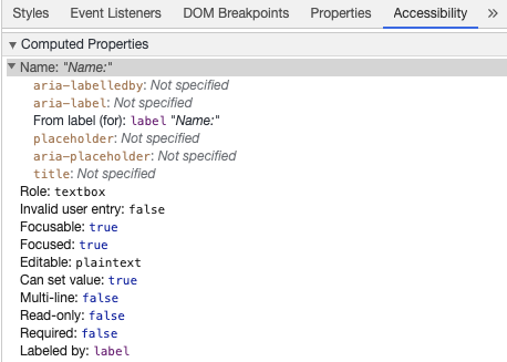
<label for="name">Name: </label>
<input type="text" name="name" id="name" v-model="name" />
如果您在 Chrome DevTools 中檢查此元素並開啟元素標籤內的無障礙性標籤,您將看到輸入如何從標籤獲取名稱
警告
儘管您可能已經看到標籤像這樣包裹輸入欄位
模板
<label>
  Name:
  <input type="text" name="name" id="name" v-model="name" />
</label>
顯式設定與 id 匹配的標籤更受輔助技術的支援。
aria-label
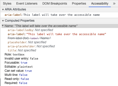
您還可以使用 aria-label 給輸入一個可訪問的名稱。
模板
<label for="name">Name: </label>
<input
  type="text"
  name="name"
  id="name"
  v-model="name"
  :aria-label="nameLabel"
/>
請隨意在 Chrome DevTools 中檢查此元素,以檢視可訪問名稱如何更改
aria-labelledby
使用 aria-labelledby 與 aria-label 類似,但它在標籤文字可見於螢幕時使用。它透過 id 與其他元素配對,您可以將多個 id 連結在一起
模板
<form
  class="demo"
  action="/dataCollectionLocation"
  method="post"
  autocomplete="on"
>
  <h1 id="billing">Billing</h1>
  <div class="form-item">
    <label for="name">Name: </label>
    <input
      type="text"
      name="name"
      id="name"
      v-model="name"
      aria-labelledby="billing name"
    />
  </div>
  <button type="submit">Submit</button>
</form>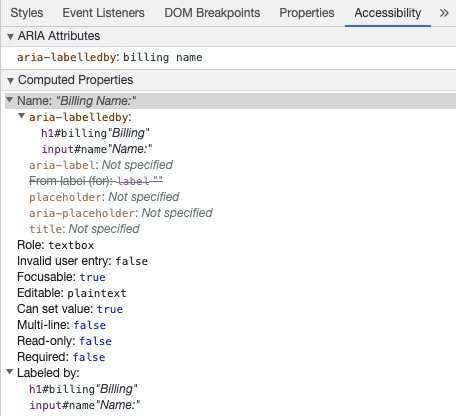
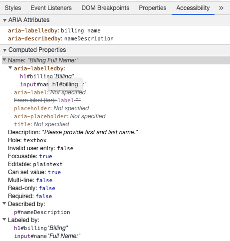
aria-describedby
aria-describedby 與 aria-labelledby 的使用方式相同,但提供了使用者可能需要的附加資訊的描述。這可以用來描述任何輸入的準則
模板
<form
  class="demo"
  action="/dataCollectionLocation"
  method="post"
  autocomplete="on"
>
  <h1 id="billing">Billing</h1>
  <div class="form-item">
    <label for="name">Full Name: </label>
    <input
      type="text"
      name="name"
      id="name"
      v-model="name"
      aria-labelledby="billing name"
      aria-describedby="nameDescription"
    />
    <p id="nameDescription">Please provide first and last name.</p>
  </div>
  <button type="submit">Submit</button>
</form>
您可以透過檢查 Chrome DevTools 來檢視描述
佔位符
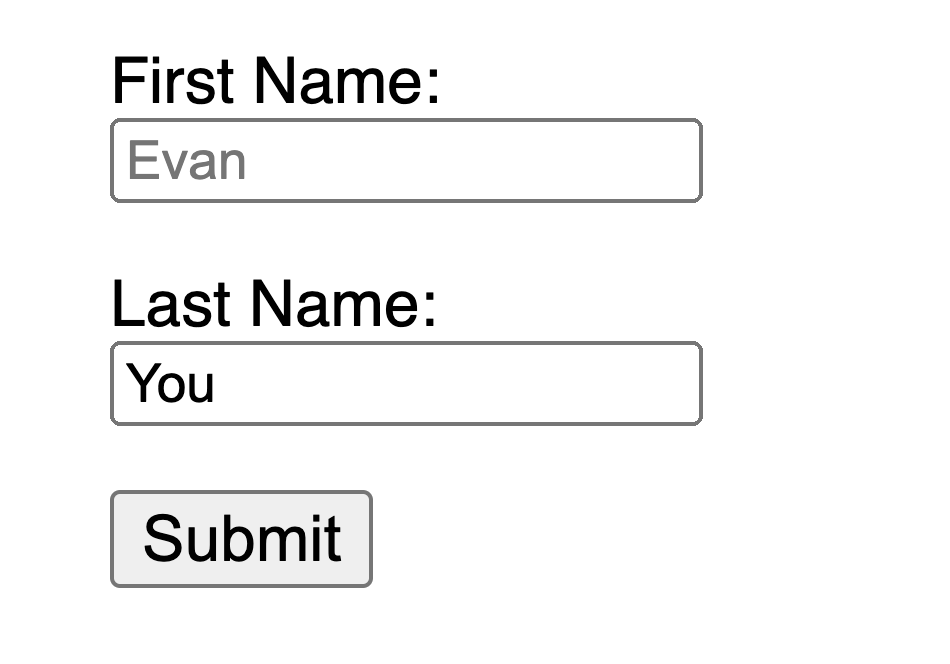
請避免使用佔位符,因為它們可能會讓許多使用者感到困惑。
佔位符的問題之一是它們預設不滿足顏色對比度標準;修復顏色對比度會使佔位符看起來像輸入欄位中的預填充資料。檢視以下示例,您可以看到滿足顏色對比度標準的姓氏佔位符看起來像預填充資料
模板
<form
  class="demo"
  action="/dataCollectionLocation"
  method="post"
  autocomplete="on"
>
  <div v-for="item in formItems" :key="item.id" class="form-item">
    <label :for="item.id">{{ item.label }}: </label>
    <input
      type="text"
      :id="item.id"
      :name="item.id"
      v-model="item.value"
      :placeholder="item.placeholder"
    />
  </div>
  <button type="submit">Submit</button>
</form>
css
/* https://w3schools.tw/howto/howto_css_placeholder.asp */

#lastName::placeholder {
  /* Chrome, Firefox, Opera, Safari 10.1+ */
  color: black;
  opacity: 1; /* Firefox */
}

#lastName:-ms-input-placeholder {
  /* Internet Explorer 10-11 */
  color: black;
}

#lastName::-ms-input-placeholder {
  /* Microsoft Edge */
  color: black;
}
最好在輸入之外提供使用者需要填寫表單的所有資訊。
說明
當為您的輸入欄位新增說明時,請確保正確地將其連結到輸入。您可以在一個aria-labelledby中提供額外的說明並繫結多個id。這允許更靈活的設計。
模板
<fieldset>
  <legend>Using aria-labelledby</legend>
  <label id="date-label" for="date">Current Date: </label>
  <input
    type="date"
    name="date"
    id="date"
    aria-labelledby="date-label date-instructions"
  />
  <p id="date-instructions">MM/DD/YYYY</p>
</fieldset>或者,您可以使用aria-describedby將說明附加到輸入上
模板
<fieldset>
  <legend>Using aria-describedby</legend>
  <label id="dob" for="dob">Date of Birth: </label>
  <input type="date" name="dob" id="dob" aria-describedby="dob-instructions" />
  <p id="dob-instructions">MM/DD/YYYY</p>
</fieldset>
隱藏內容
通常不推薦視覺上隱藏標籤,即使輸入具有可訪問的名稱。然而,如果輸入的功能可以透過周圍內容理解,那麼我們可以隱藏視覺標籤。
讓我們看看這個搜尋欄位
模板
<form role="search">
  <label for="search" class="hidden-visually">Search: </label>
  <input type="text" name="search" id="search" v-model="search" />
  <button type="submit">Search</button>
</form>
我們可以這樣做,因為搜尋按鈕將幫助視覺使用者識別輸入欄位的用途。
我們可以使用CSS來視覺上隱藏元素,但讓輔助技術仍然可用
css
.hidden-visually {
  position: absolute;
  overflow: hidden;
  white-space: nowrap;
  margin: 0;
  padding: 0;
  height: 1px;
  width: 1px;
  clip: rect(0 0 0 0);
  clip-path: inset(100%);
}
aria-hidden="true"
新增aria-hidden="true"將使元素從輔助技術中隱藏,但對其其他使用者仍然視覺上可用。不要將其用於可聚焦元素,僅用於裝飾性、重複或螢幕外的內容。
模板
<p>This is not hidden from screen readers.</p>
<p aria-hidden="true">This is hidden from screen readers.</p>
按鈕
當在表單中使用按鈕時,您必須設定型別以防止提交表單。您還可以使用輸入來建立按鈕
模板
<form action="/dataCollectionLocation" method="post" autocomplete="on">
  <!-- Buttons -->
  <button type="button">Cancel</button>
  <button type="submit">Submit</button>

  <!-- Input buttons -->
  <input type="button" value="Cancel" />
  <input type="submit" value="Submit" />
</form>
功能性影像
您可以使用這項技術來建立功能性影像。
輸入欄位
- 這些影像將作為表單上的提交型別按鈕
模板<form role="search"> <label for="search" class="hidden-visually">Search: </label> <input type="text" name="search" id="search" v-model="search" /> <input type="image" class="btnImg" src="https://img.icons8.com/search" alt="Search" /> </form>圖示
模板
<form role="search">
  <label for="searchIcon" class="hidden-visually">Search: </label>
  <input type="text" name="searchIcon" id="searchIcon" v-model="searchIcon" />
  <button type="submit">
    <i class="fas fa-search" aria-hidden="true"></i>
    <span class="hidden-visually">Search</span>
  </button>
</form>
標準
全球資訊網聯盟(W3C)的Web可訪問性倡議(WAI)為不同的元件開發Web可訪問性標準
- 使用者代理可訪問性指南(UAAG)
- 網路瀏覽器和媒體播放器,包括輔助技術的某些方面
- 創作工具可訪問性指南(ATAG)
- 創作工具
- 網路內容可訪問性指南(WCAG)
- 網路內容 - 由開發人員、創作工具和可訪問性評估工具使用
網路內容可訪問性指南(WCAG)
WCAG 2.1 在 WCAG 2.0 的基礎上進行了擴充套件,並透過解決網路的變化來實現新技術的實施。W3C 鼓勵在開發或更新網路無障礙政策時使用 WCAG 的最新版本。
WCAG 2.1 四大主要指導原則(簡稱 POUR):
網路無障礙倡議 - 可訪問的豐富網際網路應用程式(WAI-ARIA)
W3C 的 WAI-ARIA 提供瞭如何構建動態內容和高階使用者介面控制元件的指南。
資源
文件
輔助技術
測試
- 自動化工具
- 顏色工具
- 其他有用工具
使用者
世界衛生組織估計,世界上有 15% 的人口有某種形式的殘疾,其中 2-4% 的人殘疾嚴重。這大約有 10 億人;使殘疾人成為世界上最大的少數群體。
存在大量不同的殘疾,大致可以分為四類
- 視覺 - 這些使用者可以透過使用螢幕閱讀器、螢幕放大、控制螢幕對比度或點字顯示器受益。
- 聽覺 - 這些使用者可以透過字幕、旁白或手語影片受益。
- 運動 - 這些使用者可以透過一系列的 運動障礙輔助技術 受益:語音識別軟體、眼動、單開關訪問、頭部操縱桿、吸氣和吹氣開關、大號軌跡球滑鼠、適應性鍵盤或其他輔助技術。
- 認知 - 這些使用者可以透過補充媒體、內容的結構化組織、清晰簡潔的寫作受益。
檢視 WebAim 的以下連結,瞭解使用者的情況